Your Attention Please
Health & Wellbeing · Redesign · Concept · Framer build
End-to-end redesign of a breast health awareness campaign into a more sustainable, accessible, and approachable resource with one clear action.
The Your Attention Please campaign launched at Super Bowl LIX to encourage breast cancer screenings, but the digital experience felt built for temporary ad traffic rather than long-term organic discovery. I wanted to bridge that gap, repositioning a high-profile marketing moment into a permanent, accessible resource that turns cultural attention into life-saving action.
Self-initiated speculative work not affiliated with, commissioned by, or endorsed by Novartis. All brand assets belong to their respective owners.
Scroll for results

A campaign worth more people's attention
I've always been a fan of actress Hailee Steinfeld (Edge of Seventeen, anyone?), so when she became an advocate for the Your Attention Please breast health awareness campaign, it reached me through social media and struck a chord. After a tough year dealing with my mom's own breast cancer journey, I felt an urgent need to consider my own health, but wasn't sure where to start. At YourAttentionPlease.com I found genuinely valuable information, but also audience barriers I felt could be addressed.
Your Attention Please launched at Super Bowl LIX to encourage eligible women to book annual breast cancer screenings. The existing site does important work, but feels built for visitors who got there via the ads, not for anyone finding it organically, a problem made literal by a "for US residents only" banner.
I chose it as a concept test case for its real complexity: sensitive subject matter, a defined audience, genuine accessibility requirements, and a brand identity I could reposition. The campaign's core tension gave every decision a clear, motivating anchor: breasts get tons of cultural attention, just not the kind that saves lives.

Making it work for everyone
I ran this through my full workflow as though building for a real client, using the existing campaign materials to guide the client voice.
Two audiences, one site
I defined two primary personas: the Unaware, and the Informed but Idle. Every section had to work for both, not just the ideal visitor, so any section that only served one became a section that needed rethinking.
A visual identity that earns trust
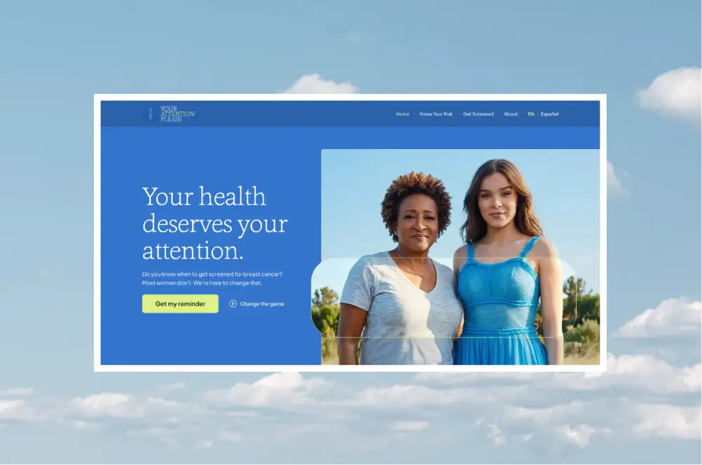
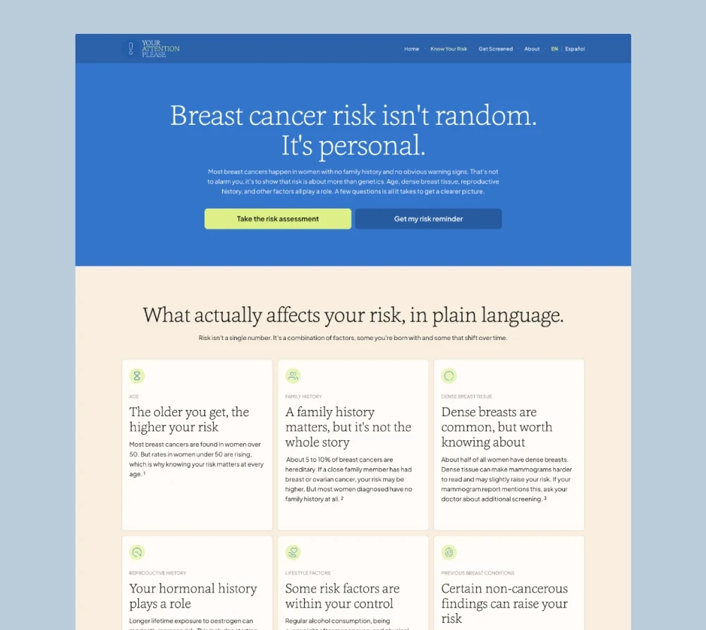
Analyzing related sites like Know Your Lemons and the National Breast Cancer Foundation revealed a potential gap: calm authority. A trusted friend who also happens to be a doctor. I avoided a pink-dominant palette (which can tip into the language of fighting disease rather than preventing it), building instead around natural imagery, warm cream surfaces, optimistic 'sky blue's, their lime accent, and editorial serif type with a humanist rounded sans-serif. The goal was to modernize/lighten the existing campaign's strengths rather than totally disconnect from them.
Messaging that puts the reader first
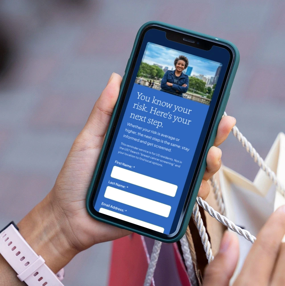
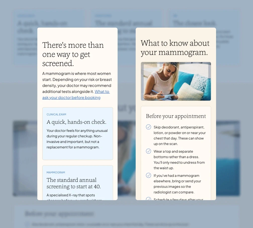
I streamlined the sitemap from 6 pages to 4, merging content to follow a more natural emotional arc and closing every page with a clear next step. Writing the copy taught me a lot (the reader is the main character!), leading with first-person outcomes rather than what the reader has to commit to: "Find out if genetic testing is right for me" rather than "Read about genetic testing". Switching CTAs from second to first person tends to increase click-through rates, and it also means every button reads meaningfully out of context for screen reader users.
Accessibility and sustainability as standard
Both were baseline requirements throughout (as on every project), not afterthoughts:
44px minimum tap targets on all interactive elements
WCAG 2.2 AA color contrast across every combination
Lightweight media and minimal unjustified decoration
A language selector, so the site doesn't exclude large user groups
Some platform constraints in Framer meant not every environmental choice was possible, but I reduced energy use wherever I had control.


What I'd do differently
This project’s sensitive content required particular care and I struggled to iterate messaging based on research alone, so I’d dedicate more time in any future work with similar subjects to speak to communities directly, so that conversational copy doesn’t just sound respectful but earns it. It reconfirmed the need for copy sign-off before design begins: visual design can prop up words that aren't quite working yet, and the result is stronger when the bare script is honest and effective on its own. I’d also build in more scope for proper sourcing (and tricky accessibility-compliant footnotes), and push further on layout to make text-heavy sections more visually engaging.

The redesign turns a high-profile campaign moment into a friendlier resource that keeps working: tighter sitemap, first-person CTAs, a language selector, and WCAG 2.2 AA compliance throughout. Going through the process personally meant I left with a screening reminder booked. That felt like the right outcome to test against.